6 different styles for unique packaging design
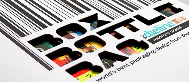
Today, we thought we would highlight the amazing packaging design featured in Andrew Gibbs’ Box Bottle Bag: The World’s Best Package Designs from TheDieline.com – one of our favorite recent design books.
Gibbs does a great job seeking out and discovering the “very best” packaging designs out there, which he categorizes as one of six style types:
- Luxe: “Luxurious, elegant, lavish, opulent and refined. Packaging that demands a premium.”
- Bold: “Bright, colorful, and eye-catching. Packaging design that stands out and makes a statement.”
- Charming: “Playful, fun, clever, and cheerful. Packaging that makes you smile.”
- Casual: “Practical and straightforward. Packaging that you see in everyday life.”
- Nostalgic: “Vintage, classic, retro, antique, old-fashioned, and reminiscent. Packaging that reminds you of another time.”
- Crisp: “Clean, contemporary, geometric, simple. sleek, stylish, tidy. This section is about packaging that really lives up to the old adage ‘less is more.’”
Let’s take a look at each of these categories and try to find out why they work.
1. Luxe
JAQK Cellars
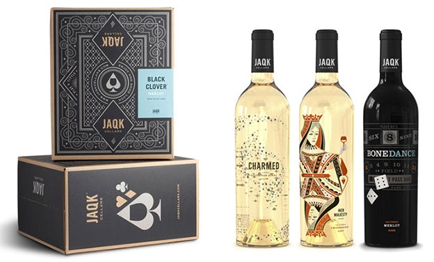
Beverage packaging: JAQK Cellars (via idsgn)
JAQK stands for the jack, ace, queen and king in the deck of cards. This wine company uses that idea to create some very elegant designs for their wines. Their gift boxes also include a custom deck of cards, which uses the same artwork as the bottles. Genius.
Coco Monoi
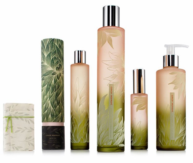
Packaging: Coco Monoi (via Packaging of the World)
Coco Monoi opted for an extremely sophisticated type of packaging. Gibbs points out that the packaging contains an overflow of flower and leaf art, which is inspired by one of the main fragrant essences found in the bath products: gardenia. The color transitions for the bottles are elegantly subtle.
2. Bold
Ugly Mug Coffee
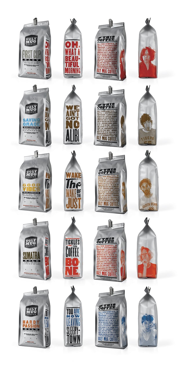
Beverage packaging: Ugly Mug Coffee (via Graphis)
If there is any product that requires boldness in its packaging, it is coffee. Ugly Mug Coffee does a good job of waking you up with their packaging as well as their coffee. The design approach contains good humor, as is implied by the company’s name.
The use of traditional letterpress and pictures of really, really, really tired people is a good combination of ugly and beautiful.
Melt
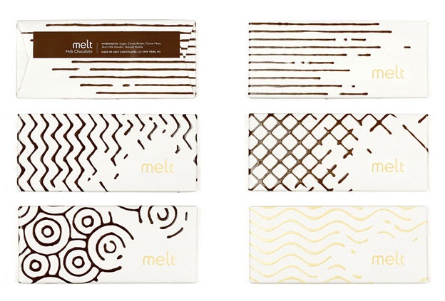
Food packaging: Melt (via Lovely Package)
Melt, a gourmet chocolate shop, plays with the characteristics of melted chocolate in its packaging and logo in a simple, fun way. My mouth is watering.
3. Charming
Durex Fantasy
Packaging: Durex Fantasy (via La Veilleuse Graphique)
Durex Fantasy is a sub-brand of condoms that encourage women to carry them “because you never know.” The packaging is clever, lighthearted and does not make the contained product obvious, so women need not fear for being judged. It suggests sex without being vulgar.
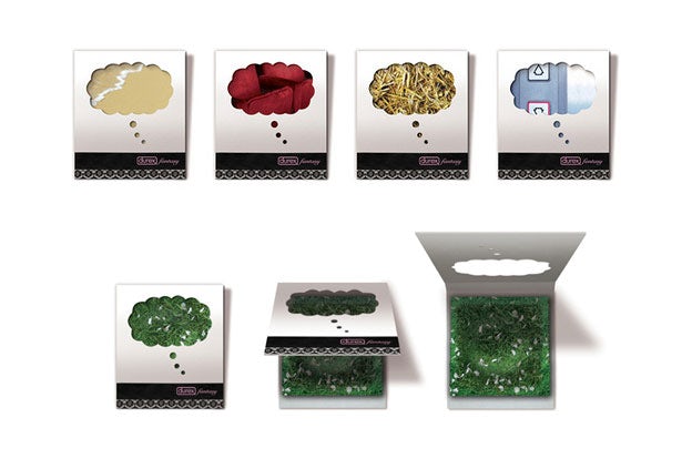
Aromatherapy Interventions
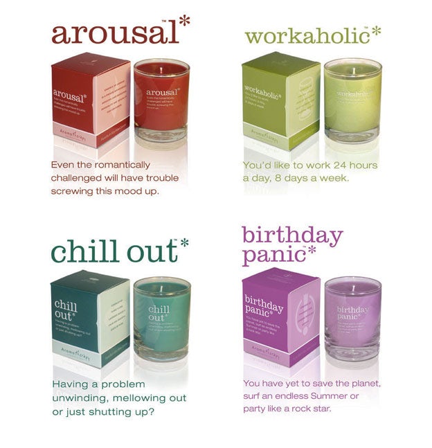
Packaging: Aromatherapy Interventions (via NOTCOT)
Aromatherapy Interventions’ packaging designs for 25 different candle concepts each contain little quips to make you smile. Mood = changed.
4. Casual
18 Rabbits Granola
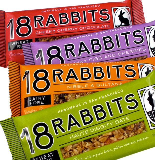
Food packaging: 18 Rabbits (via Strohl)
Simple and straightforward. 18 Rabbits utilizes different colors for different flavors of granola. The use of bold lettering causes it to stand out from its competitors, while also making it easy to read.
Waitrose Pickles
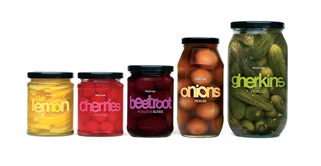
Food packaging: Waitrose Pickles (via Global Package Gallery)
Waitrose Pickles’ packaging is one of the simplest I have ever seen, as well as one of the best. What did they do right? The company does a great job of showcasing its product in its natural state by using a transparent jar and not cluttering it with a large label or too many images.
In consequence, it gives a nice “what you see is what you get” vibe. The spare graphics include colorful letters that squish together to resemble the products inside the jar. Yum.
5. Nostalgic
826 Valencia
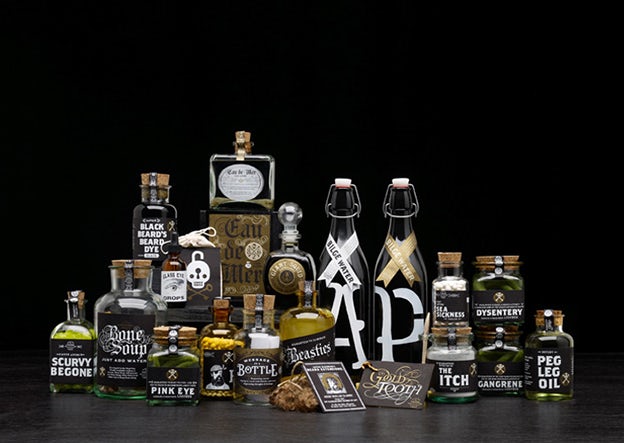
Packaging: 826 Valencia (via Invisible Creature)
826 Valencia is a nonprofit tutoring center located in San Francisco’s Mission District. So why are they making these pirate products? Well, the founders learned that the space they own was zoned for retail use, so they opened a “pirate supply store” to meet city regulations.
Do these products work? No idea, but they look amazing. All the proceeds from this store directly benefits 826 Valencia’s writing programs.
Lovejoy Vodka
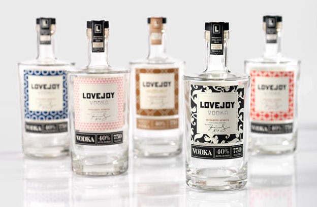
Beverage packaging: Lovejoy (via Lovely Package)
This vodka packaging contains a bit of the history of Portland, where the spirit is produced. Integrity Spirits needed a new name for its vodka so it went with Lovejoy, who was a pioneer settler of the city (there is a street and park named after him now).
Lovejoy is also a combination of two concepts, love and joy, that Integrity Spirits believes should be integral to the vodka-drinking experience and wanted to promote. The brand offers different packaging for different types of vodka, each good for a different mood or occasion.
6. Crisp
Blossa Annual Edition
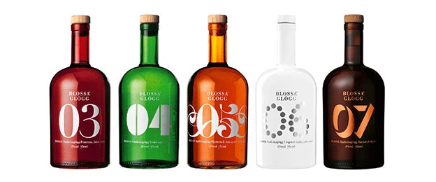
A crowd favorite (and designer darling), this annually released mulled wine that changes its design and flavor each year. Yet while the colors and type treatments may change, Blossa controls its brand through the consistent round bottle and their crisp, contemporary look.
STORIES
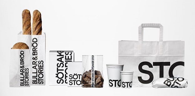
STORIES’ packaging is as clean and simple as it gets. The bold black and white style (along with transparent packaging) lets the cafe’s food and drinks take center stage, while the modern design gives the cafe a cool, urban feel.
Conclusion
There are many lessons to be learned from these different categories. A lot of products lend themselves well to a certain category, and good designers will take that to account while also considering what message the company is trying to convey and what it wants to communicate to consumers. Do your research and let your ideas flow.